Where's Naomi Klein when you need her?
 Let's face it: the British public at times has utterly appalling taste. We've been putting up with soaps for the last 50 years, Heartbeat still exists and somehow the sixties are still continuing, Little Britain and Catherine Tate are the most popular comedies, a third movie based on a theme park ride which was panned by the critics is number one at the box office, and to cap it all, Rihanna with her UMBRELLA ELLA ELLA ELLA EH EH EH is sitting on top of the singles chart.
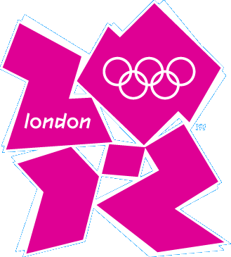
To remind us then that we can still tell shit on a stick when we see it, the logo for the 2012 Olympics has been universally pilloried. Tory stuck-up shagger extraordinaire Seb Coe, who has a face so punchable it's a wonder that he doesn't have a permanent black eye, solemnly informed us:
It's not a logo, it's a brand that will take us forward for the next five years.
And then Tessa "I've never met my husband" Jowell opined that:
"This is an iconic brand that sums up what London 2012 is all about - an inclusive, welcoming and diverse Games that involves the whole country.
"It takes our values to the world beyond our shores, acting both as an invitation and an inspiration.
"This is not just a marketing logo, but a symbol that will become familiar, instantly recognisable and associated with our Games in so many ways during the next five years."
Great. Just one problem: what the fuck is it meant to be, look like, or do, other than be hideously garish and look like it was shat out by a jaded marketing employee just before he went home on a Friday to jerk himself into oblivion and cry himself to sleep?
Maybe I'm a little slow, but it took me a couple of hours to realise that these crudely cut out shapes are meant to somehow look like 2012. Is it also meant to sort of look like a runner on his marks, or is that just my imagination? The first thing I thought of when I saw it was it sort of looks like someone "walking like an Egyptian". Skewed at an angle. Or someone scratch mixing on some invisible decks. Other suggestions for what it looks like have come thick and fast. Mr Eugenides thinks it looks like Lisa Simpson giving someone head, which if you're so inclined, the internet can provide comparison with. Others have identified that it looks a little like a swastika cut up, which would be fitting with the kind of approach the government have taken to anyone criticising the planning for the Olympics: to quote Tessa Jowell responding to a Tory, that was a vote for Paris!
The ministers, it seems, have fallen hook line and sinker for the whole Wolff Olins manifesto of managerial corporate bollocks. Their website is so offensively awful, complete with huge BRAND = pages, that it seems like the kind of satire that Chris Morris would subject the world of advertising agencies devising brand strategies to. No one seems to have informed them that the very reason why brands have had to become so insidious, so ingratiatingly offensive and in your face is because all subtlety has been removed because they think people can't handle it any more. From the people who brought you FCUK, that hilarious and brilliant two-fingered salute to the squares who think a word that looks much like fuck being emblazoned across t-shirts and billboards isn't very clever or amusing, now comes RED, which Olins worships, meaning that you can go on consuming the same as before, but now a certain amount of profits go to Aids victims in Africa, which makes it all better. It of course had to be the work of Bono, whom alongside Bob Geledof has spent the last God knows how many years telling the poor to give all their money to charity, while never seeming to do much to redistribute their own vast wealth. Some would call it ironic that companies such as Gap, which have long used sweatshop labour and paid their suppliers an absolute pittance, and Motorola, one of the very companies that is currently bleeding the Democratic Republic of Congo dry through grabbing its reserves of coltan in order to produce tantalum, which makes up the essential parts of mobile phones amongst other things, are paid up members of RED: I would call it the ever tightening grasp of capitalism pretending to compassionate while still spitting in everyone's face.
How could New Labour not fall hopelessly in love with such a vacuous, self-serving ideology? It perfectly reflects everything they've ever stood for. The logo itself is, as others have already identified, is a perfect metaphor for what the games themselves will inevitably become - a ingloriously expensive failure that we'll be cursing for decades.
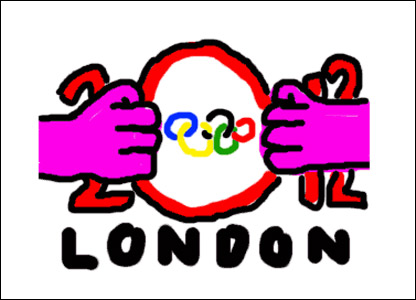
Still, at least someone managed to get the BBC to put this delightful parody up on their alternative logos page, before it was hastily pulled:
Labels: Olympic logo, shit
| Permalink![]()
![]()


